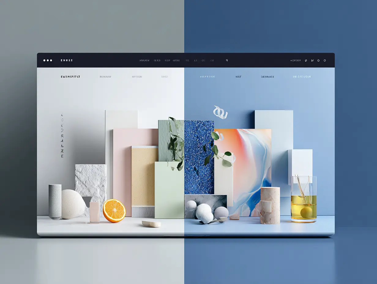
The world of design just split in two.
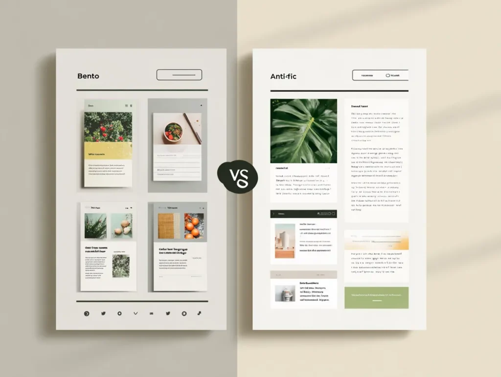
On one side, we’ve got the Bento Box style, clean, tidy, like your favorite lunch packed in little squares.
On the other, there’s the Anti-Grid, wild, messy, creative chaos that breaks the rules on purpose.
They’re everywhere. On websites, product pages, portfolios, even pitch decks.
But which one is right for you?
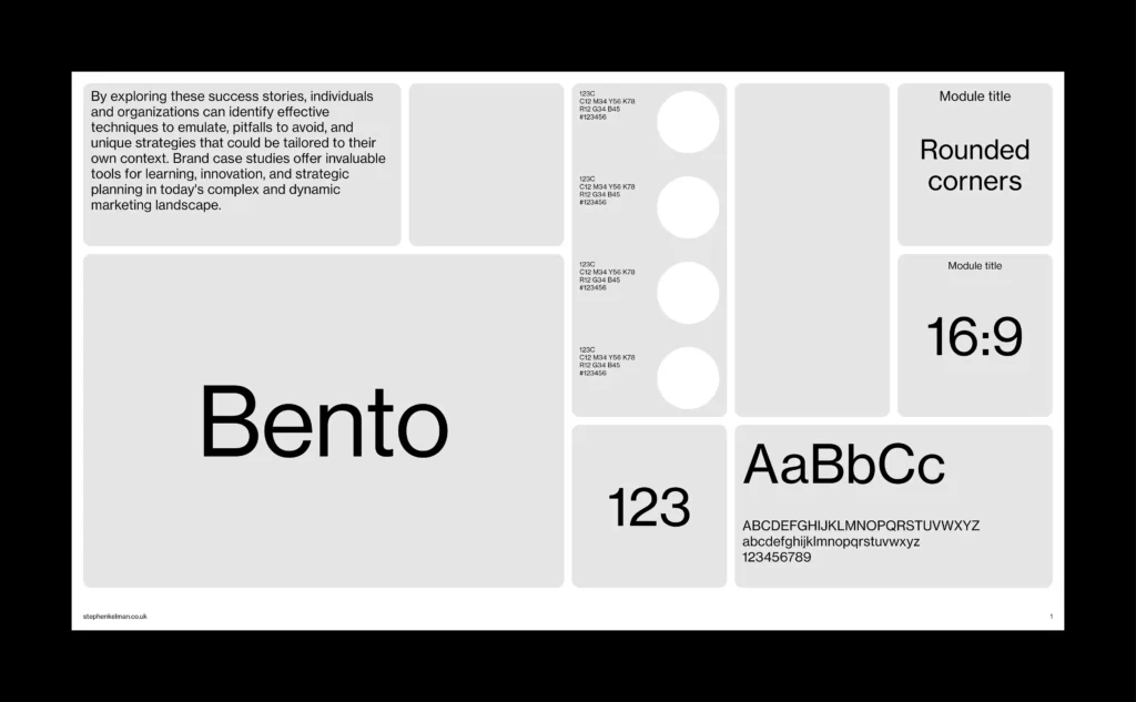
What’s the “Bento Box” look?
Think: Apple product pages. Clear sections. Smooth boxes. Everything has a place.
This design trend feels modern, trustworthy, and easy to scan. It’s perfect for:
- SaaS startups
- Corporate websites
- Agencies who want to look polished and organized
Why it works:
People don’t want to “figure out” what you do. The Bento Box makes things obvious. It builds trust with structure.
What’s the “Anti-Grid” vibe?
Now flip it.
Think: fashion brands, personal portfolios, creative studios. The Anti-Grid is messy on purpose. Images spill over. Text breaks lines. It feels alive.
This trend is great for:
- Lifestyle and culture brands
- Creators and artists
- Founders who want to show personality
Why it works:
It feels human. Imperfect. Emotional. It draws you in, not because it’s neat, but because it’s bold.
So… Bento or Anti-Grid?
Here’s the real trick: it’s not just about style. It’s about how you want people to feel.
- Want to build clarity and trust? Go Bento.
- Want to build emotion and connection? Go Anti-Grid.
At Aella, we help brands figure out not just what looks good, but what fits who they are.
Need help choosing the right design direction?
Let’s talk, or slide into our DMs on Instagram or LinkedIn.
Bonus tip: Mix them
Some of our favorite designs use both. Clean structure with just a splash of chaos. That’s when the magic happens.


3 Responses
This is my first time pay a quick visit at here and i am really happy to read everthing at one place
I appreciate you sharing this blog post. Thanks Again. Cool.
Your writing is a true testament to your expertise and dedication to your craft. I’m continually impressed by the depth of your knowledge and the clarity of your explanations. Keep up the phenomenal work!