Turning Fitness Into a Visual Vibe
When Nathan, the owner of FitFinity, came to Aella Creative Force, he didn’t just want a logo.
He wanted a look, a language, and a vibe that people would feel the second they saw the brand.
He wanted energy.
Boldness.
Something that didn’t whisper “fitness.”
Something that shouted it in neon.
Let’s break down how we built FitFinity into a brand that moves, even before the first squat.
The Idea Behind FitFinity
The name FitFinity wasn’t just made to sound cool.
It was inspired by one of the most iconic and versatile machines in any gym: the combo power rack and bench press.
💡 This piece of equipment represents everything FitFinity stands for:
Full-body training. Functional design. Limitless strength.
It’s a fitness essential — and it inspired the name:
Fitness + Infinity = FitFinity
A mindset that’s built to push past limits.
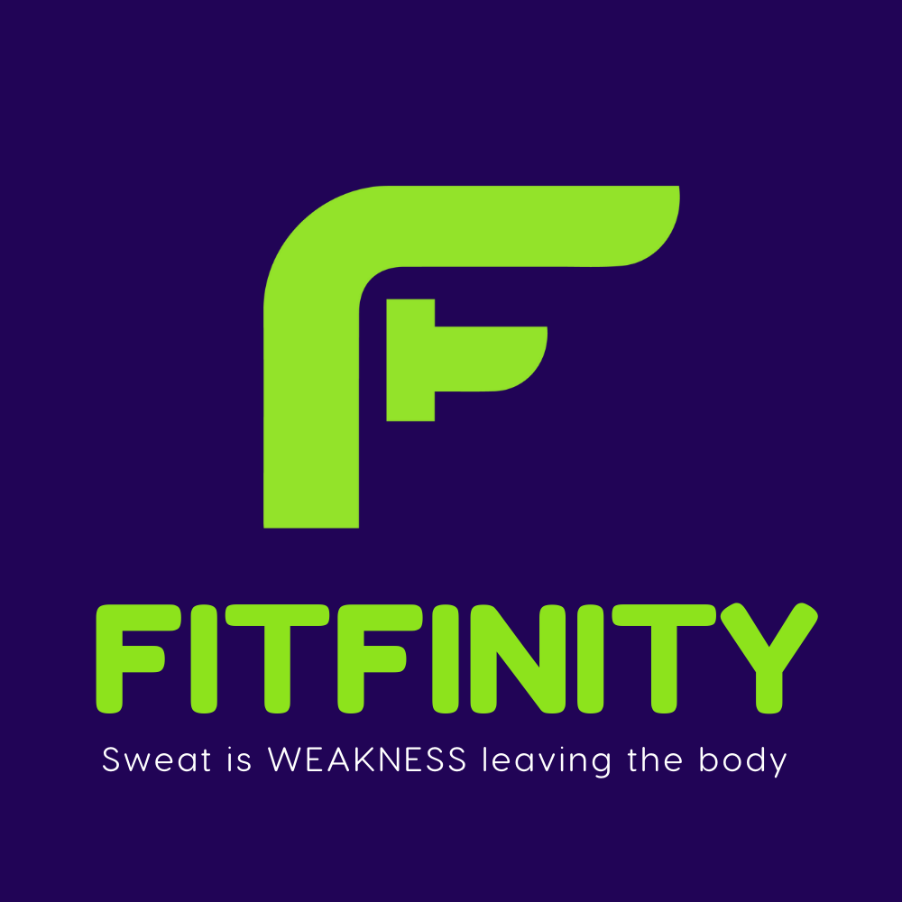
And the logo?
The top curve of the ‘F’ was inspired by the arch of a power rack.
The lower stroke? A nod to the shape of a dumbbell — simple, strong, and classic.
The brand’s identity is rooted in real gear, real movement, and real progress.
It’s not abstract. It’s built — like the people who train with it.
We leaned into that with the tagline:
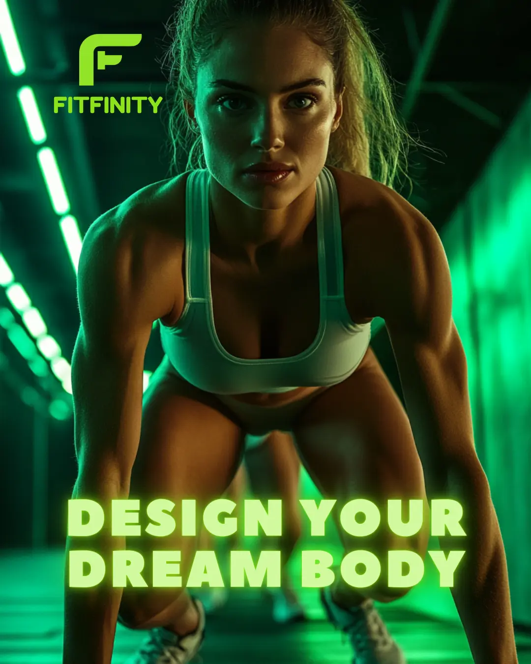
“Sweat is WEAKNESS leaving the body.”
It’s tough. It’s confident. It’s not for everyone, and that’s exactly the point.
This isn’t yoga-in-the-park branding.
This is power-lifting under LED lights branding.
Logo Design: Movement + Strength
The F icon is sharp, strong, and modern. It’s also:
- Monolithic — built like a weight block
- Angular — like the form in a well-held squat
- Continuous — representing flow, strength, and endurance
The green we used is electric. It’s not soft. It says:
⚡ “We’re not playing around.”
Combined with the deep night purple, it creates a high-contrast visual that feels like a fitness club meets nightclub.
Think: energy, intensity, edge.
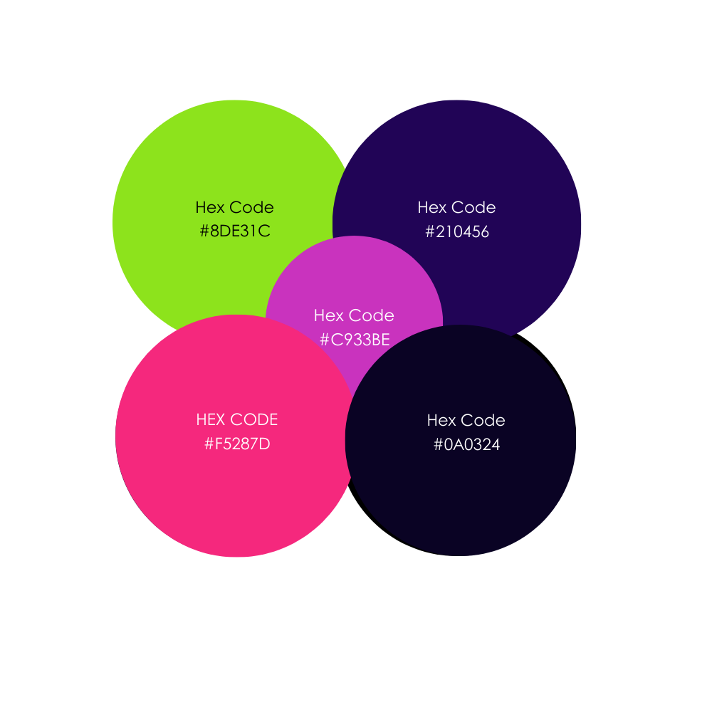
Neon Colors, On Purpose
You’ll notice one thing fast on their feed:
It glows.
We used a color palette designed to:
✅ Pop on dark backgrounds
✅ Feel energizing, like pre-workout visuals
✅ Stay consistent across posters, templates, and stories
- 💚 #8DE31C – The core neon green
- 💙#210456 – Brand base
- 💖#F5287D – Used for callouts & emphasis
- 💜 #C933BE – A softer highlight
- 🖤 #0A0324 – Dark mode perfection
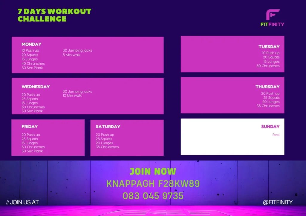
Class Schedule = A Visual System
This isn’t your basic gym timetable.
We designed the class schedule like a music festival lineup — boxes, color blocks, and movement.
Why?
- It’s easier to scan
- It highlights the variety of classes
- It turns logistics into a visual identity piece
Each day has its own color-coded layout, but it still feels unified. That’s branding working behind the scenes.
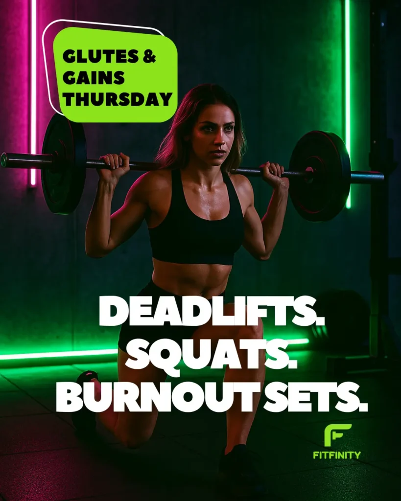
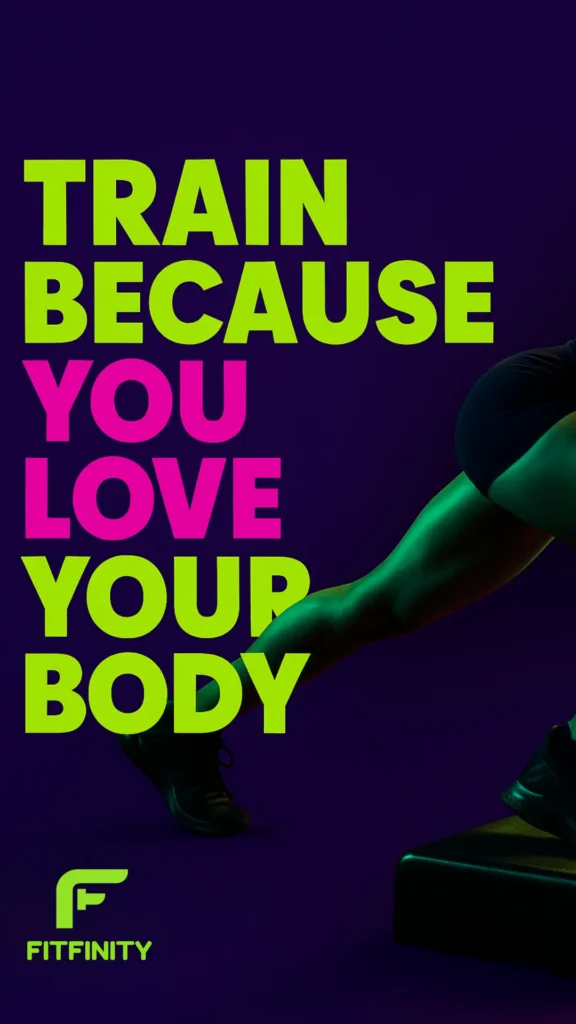
Instagram Templates: Designed to Perform
We didn’t want the feed to blend in. So we made it glow.
Each template follows these rules:
🎯 Bold Fonts — Fredoka and Visby Round CF give a clean but powerful look
🎨High Contrast — Neon on dark = attention-grabbing
💬 Short Phrases — Like motivational punches
📱 Reels-Ready — Works for stories, posts, and motion
The post that says “TRAIN BECAUSE YOU LOVE YOUR BODY”?
That’s not just content. That’s brand ethos.
What We Built — and Why It Works
✔️ A logo that looks like a badge of power
✔️ Colors that scream confidence
✔️ Templates that turn posts into punchlines
✔️ A brand voice that’s direct, bold, and unapologetic
✔️ A schedule that isn’t just functional — it’s visual marketing
And most importantly:
A cohesive system that helps FitFinity look premium, everywhere.
Final Thoughts
FitFinity didn’t want to be another local gym.
They wanted to look like a movement.
And from the logo to the lighting, that’s exactly what we designed.
You don’t need to be global to look unstoppable.
You just need smart design, bold decisions, and a brand that feels like more than just workouts.
🚀 Get in touch today to refine your branding for 2025 and beyond!


2 Responses
Truly exceptional writing. I’m a new fan.
You’ve really got a knack for cutting through the noise and getting to the heart of the matter. It’s so refreshing to find original and well-argued perspectives like these. This is truly high-quality content.